Tuesday, July 28, 2015

Tick Tock You Don't Stop

Before I go on I would like to acknowledge that I used lyrics from a cheesy early 90's song as inspiration for the title. I'm deeply sorry for the ear worm that now plagues you.

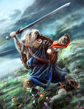
This is Clockwork Sparrow. Beautiful and deadly. 

In my last post on Kimmy Watson I showed how to build up different elements of an image using different programs. I am keeping up with the One Hit Kill theme but showing a little less of the step by step process. It's not because I put less time into the illustration...that most certainly was not the case. It's just that some pieces are more complex than others. This particular piece was what I like to call a "discover as you go" piece.


A lot of the small parts are derivatives of other small parts. In Kimmy all the badges, for example, were their own imagery. 

You'll notice in the process gif below that the piece went through many small changes. The original sketch of the bird changed position and posture. As I started to flesh out the bird I realized that she (definitely a she) looked disjointed. Smoother wings allowed for a more natural look.

I also played around with the color scheme a bit. Not too much but enough to change the mood from a bright fun day to a more overcast day. When I sent the client my progress shot he mentioned that he preferred a more "London sky over a Phoenix sky". This gave me a keen sense of the mood he was going for.

I allowed myself to play around with softer vs harder edged backgrounds, shifts in color, changes in saturation as well as adding and subtracting little glowy bits. I needed to keep a strong silhouette so clear separation of temperature and value was key. Warm bird cool background. It's easy for me to get caught up in the details so shrinking the image down really small and adding a saturation layer with 0 saturation allowed me to see the overall impact of the image. 


No matter what changes you make during the process always remember that the sketch and final achieve the same goal. As a teacher I often combat the practice of completely changing an idea without communication. If you get a sketch approved that's the image you need to complete. Don't change the approved image because you came up with something better. Bad idea. Make sure you stick to the plan. People don't like big surprises. 

Unless it's cake. Cake is a great surprise.


Tuesday, July 21, 2015

Kimmy Watson Process - Illustrator, Photoshop and Painter, oh my.

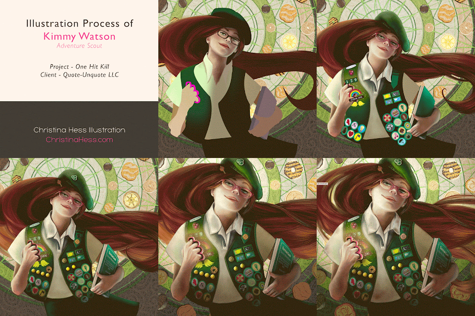
Recently I was called upon to create six images for a card game called "One Hit Kill" created by John August. There are some super fun cards and I had the pleasure of creating a handful of them. This particular card I'm featuring was one of my favorites to work on. Basically it's a badass scout ready to take on the world and kick some butt. Images of a sweet girl in uniform yielding a baseball bat, hunting knife and a black and blue eye immediately entered my head. 

Stop. Reign it in. This has to have a softer approach than that plus it needs to remain kid friendly. So let's think magical or smart and sassy tough girl. Let's give the client a choice.

FYI: I was netflixing Buffy the Vampire Slayer while working on this piece. Super girl power infused inspiration right there.


Original Graphite Sketches. She needed to be a sassy scout with attitude. I thought pink brass knuckles would be a fun addition. I also thought that a magical cookie box could hold a lot of power. After all they don't ever last very long in the cupboard...constantly calling out my name. Pretty powerful cookies if you ask my bathroom scale.

Value Comps done in Photoshop. Here I decided to add a bit more to the cookie box  by showing magical flying thin mints. The brass knuckles were chosen by the client and I was off and running. It was time to get started on the base. Below I have excerpts of the illustration. At the end of the post there is a gif that shows a step by step process from sketch to finish.


Adventure Scout Badges in Adobe Illustrator. Although they play a small part in the whole illustration  I'm a sucker for detail and it's important to keep them clear and obvious. This is where vector art helps me not to fall into the "I want to get super detailed on these little things that no one will see once it's reproduced into a tiny card". Illustrator becomes a great time management tool.

I then copy and paste them into Photoshop. I added stitching and textures in Corel Painter and then again in Photoshop. Because I originally had the icons figured out in Illustrator I could concentrate on just the detailing in the raster file. Because I worked this way I easily cut my time in half if not more. 


I wanted a round cookie motif in the background so I designed the initial base in Illustrator using the  polar grid and basic shape tools. Oh, and the almighty pen tool. Don't hate the pen tool. Love it.


After the copy and paste into Photoshop I then added additional lighting detail in Corel Painter. And then additional texture in Photoshop. It turns out that I really like the way the cookies look. I may decide to create a pattern of them somewhere down the line and upload them to my Spoonflower store. Cookie fabric. Yeah. That could work.
Sidenote: The texture is a scanned rice paper I bought in the wee days of college. I love the way it interacts with the paint.


The cookie pin lapel was originally created as a vector and then rendered in Painter to add volume. But hold up! I had to change the trefoil cookie for trademark reasons. Nobody needs to get a cease and desist letter from a bunch of angry girl scouts. That could be frightning. Instead the client and I decided on an AS logo indicating "Adventure Scout".

Some more badges. I knew most of these would be covered by her arm and pink brass knuckles but I still needed them drawn out. 


This is the final before the cookie correction. Below is a step by step process of the piece which includes the final cookie correction. It's about 10 seconds so it shouldn't bore you too fast.


Up Next...Clockwork Sparrow.

Thanks for visiting!