Monday, October 24, 2016

Go Learn Something

There is an extreme benefit to continuous learning that I cannot stress enough. This isn't a pitch because I teach. I'm saying this because I consider myself a constant student. No matter where we are in life we can learn more.

The day to day routine can play havoc with the fluidity of creation. In the past I have explored numerous illustration events to learn how to interpret my position in the world of illustration. I've taken workshops, attended conferences and exhibited at conventions. Every situation informed my work in a positive way. Each experience shook the stagnant fog out of my head. Education, no matter how you get it, is the cornerstone of every new skill and technique. It is the foundation to a stronger body of work.

Honey Cargo wip.

One year ago I had a great opportunity to create The Nutcracker, a children's book. That experience opened up new doors that challenged my skill set and preliminary processes. After the completion of the project I started researching classes. I needed to be a student again and be immersed in the learning process. I needed answers to the questions I had recently discovered.

Sirens wip

Listening to Paper Wings, Stories Unbound and Escape from Art Jail podcasts by the Oatley Academy introduced me to new learning possibilities. There were a slew of classes available through the site so I dug in and found Painting Drama. Painting narrative scenes while focusing on creating drama in visual storytelling. Perfect!

During the summer the class met on Thursdays at Noon EST in a digital classroom. Chris Oatley guided the class with the assistance of the effervescent Erika Casab. As determined as I thought I was there were some mighty impressive dedication from my classmates. Several people were taking this class at 2am in Australia and a sprinkling of other times in Iceland, Israel, Mexico, Hungary, the UK and the list goes on. I was immediately impressed and humbled by my new colleagues and thier undying dedication.

Cutie Pie wip

The prompts were open and flexible and the studies were invaluable to the development of strong compositional skills. Abstract solutions to fine tuned values were part of the experience. Opening the doors between representational art and abstract art was one small sliver of the whole process.

Abstract studies to build exciting unexpected compositions. These were some of the 150 studies my partner, Rachel and I shared.

Chris offered refreshing approaches to shaking up the excitement of a composition while focusing on analytical compositional decisions. How revitalizing this was to me as both an artist and an instructor.

Black and White Master copies helped identify important compositional decisions

There were numerous things about this course that I found invaluable. I'm not going to give their secrets away so I'll leave it at this.... If your interested in learning the visual language of creating a strong narrative piece in a clear and concise manner with informed and analytical methods then this is the class you should consider. It's intense. It's inspiring. It's super fun.
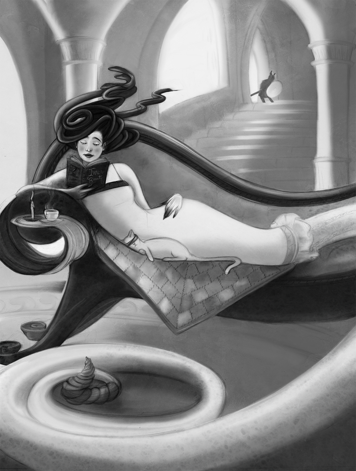
Inner Beauty

Thanks to Chris and The Oatley Academy for the opportunity to learn from your expertise and thanks to my fellow classmates for the constant inspiration and dedication you all have. Being part of a like minded group striving to be the best they can be is a satisfaction that in incomparable.


Wednesday, September 28, 2016

The Nutcracker


This is a mistake. 

That's what I kept saying throughout the creation of this book.  But when you give yourself no choice it's amazing what your able to accomplish.


Hardback copy. This was the first illustration completed for the book. Often publishers need the cover before the book is complete so they can feature it in their catalog.

It was March 2015 when I sat in The Palm with John discussing The Nutcracker. The more we spoke the more impossible it seemed. The more sips of wine I had the more I was talking myself out of it. The holiday release schedule coupled with my full freelance schedule was only one hurdle to consider. That alone was a very tall hurdle.

As I left the building the thought of attempting to complete this 64 page behemoth in the next nine months was terrifing. I'm a notoriously slow painter. I like creating detail and it doesn't matter if I'm working digitally or in oils. I'm simply ... just ... slow. 


The second completed illustration. This is a four page gatefold featured at the end of the book. This image alone took over 30 days to illustrate.


I wanted to do it. It was a perfect combination of narrative, history, fantasy, animals, humans and decorative elements. It was everything I loved to illustrate....and all the mice! Yes! 

However, I was afraid to commit.


Detail of mice coming out of the floorboards.

Maybe it was the crisp Spring air promising warmth or maybe it was the fog in my head from the last semester of an overloaded teaching schedule because I eventually said yes. Yes, I'll take on a 64 page children's book in 9 months. Yes, I'll complete over 35 paintings...in under...nine...months.

I gave myself no choice. And I wasn't going to pass up a dream job because of fear and uncertainty.


I always wanted to paint a castle. Check!

I won't go into the angsty details of doubt, hair pulling and constant anxiety but I will say that it was a long several months. Although there were many all nighters and countless paint filled weekends I was covering new ground. I was finding inventive ways to tackle fresh challenges. This process was invigorating. I was riding the Yin Yang Rollercoaster that my colleagues know so well. (I know your nodding)


Queen Mouserinks makes her entrance.

Always seeking to educate myself and take away new information that I can add to my arsenal of skill sets this project quadrupled my abilities. Environments, text/design marriage, multiple figure scenes were some of the new elements I encountered. It wasn't a surprise that as a constant student I had more questions at the end of the project than I did at the beginning. But that explanation belongs in a separate post. ;)


Don't scare the children. My initial sketch was a bit scary so I redrew the mice eating sugar plums as they fought.


My original text placement was alright but Ali from Tango Media made it fantastic.


Big wooden castle was super fun to create.


Working on The Nutcracker catapulted me into another world of possibilities which focused my attention on new goals for the future. And wow...do I have new goals!

My final take on this project? Taking on this job was one of the best decisions I have ever made. 

* A super big thank you to John Whalen and Alexandra Lewis for being such great publishers at Cider Mill Press. And Ali Freile at Tango Media for being great to work with (as she always is) and doing a spectacular job on the design of the book.  


The End

Visit ChristinaHess.comchristinahess.com for more


Tuesday, July 28, 2015

Tick Tock You Don't Stop

Before I go on I would like to acknowledge that I used lyrics from a cheesy early 90's song as inspiration for the title. I'm deeply sorry for the ear worm that now plagues you.

This is Clockwork Sparrow. Beautiful and deadly. 

In my last post on Kimmy Watson I showed how to build up different elements of an image using different programs. I am keeping up with the One Hit Kill theme but showing a little less of the step by step process. It's not because I put less time into the illustration...that most certainly was not the case. It's just that some pieces are more complex than others. This particular piece was what I like to call a "discover as you go" piece.


A lot of the small parts are derivatives of other small parts. In Kimmy all the badges, for example, were their own imagery. 

You'll notice in the process gif below that the piece went through many small changes. The original sketch of the bird changed position and posture. As I started to flesh out the bird I realized that she (definitely a she) looked disjointed. Smoother wings allowed for a more natural look.

I also played around with the color scheme a bit. Not too much but enough to change the mood from a bright fun day to a more overcast day. When I sent the client my progress shot he mentioned that he preferred a more "London sky over a Phoenix sky". This gave me a keen sense of the mood he was going for.

I allowed myself to play around with softer vs harder edged backgrounds, shifts in color, changes in saturation as well as adding and subtracting little glowy bits. I needed to keep a strong silhouette so clear separation of temperature and value was key. Warm bird cool background. It's easy for me to get caught up in the details so shrinking the image down really small and adding a saturation layer with 0 saturation allowed me to see the overall impact of the image. 


No matter what changes you make during the process always remember that the sketch and final achieve the same goal. As a teacher I often combat the practice of completely changing an idea without communication. If you get a sketch approved that's the image you need to complete. Don't change the approved image because you came up with something better. Bad idea. Make sure you stick to the plan. People don't like big surprises. 

Unless it's cake. Cake is a great surprise.


Tuesday, July 21, 2015

Kimmy Watson Process - Illustrator, Photoshop and Painter, oh my.

Recently I was called upon to create six images for a card game called "One Hit Kill" created by John August. There are some super fun cards and I had the pleasure of creating a handful of them. This particular card I'm featuring was one of my favorites to work on. Basically it's a badass scout ready to take on the world and kick some butt. Images of a sweet girl in uniform yielding a baseball bat, hunting knife and a black and blue eye immediately entered my head. 

Stop. Reign it in. This has to have a softer approach than that plus it needs to remain kid friendly. So let's think magical or smart and sassy tough girl. Let's give the client a choice.

FYI: I was netflixing Buffy the Vampire Slayer while working on this piece. Super girl power infused inspiration right there.


Original Graphite Sketches. She needed to be a sassy scout with attitude. I thought pink brass knuckles would be a fun addition. I also thought that a magical cookie box could hold a lot of power. After all they don't ever last very long in the cupboard...constantly calling out my name. Pretty powerful cookies if you ask my bathroom scale.

Value Comps done in Photoshop. Here I decided to add a bit more to the cookie box  by showing magical flying thin mints. The brass knuckles were chosen by the client and I was off and running. It was time to get started on the base. Below I have excerpts of the illustration. At the end of the post there is a gif that shows a step by step process from sketch to finish.


Adventure Scout Badges in Adobe Illustrator. Although they play a small part in the whole illustration  I'm a sucker for detail and it's important to keep them clear and obvious. This is where vector art helps me not to fall into the "I want to get super detailed on these little things that no one will see once it's reproduced into a tiny card". Illustrator becomes a great time management tool.

I then copy and paste them into Photoshop. I added stitching and textures in Corel Painter and then again in Photoshop. Because I originally had the icons figured out in Illustrator I could concentrate on just the detailing in the raster file. Because I worked this way I easily cut my time in half if not more. 


I wanted a round cookie motif in the background so I designed the initial base in Illustrator using the  polar grid and basic shape tools. Oh, and the almighty pen tool. Don't hate the pen tool. Love it.


After the copy and paste into Photoshop I then added additional lighting detail in Corel Painter. And then additional texture in Photoshop. It turns out that I really like the way the cookies look. I may decide to create a pattern of them somewhere down the line and upload them to my Spoonflower store. Cookie fabric. Yeah. That could work.
Sidenote: The texture is a scanned rice paper I bought in the wee days of college. I love the way it interacts with the paint.


The cookie pin lapel was originally created as a vector and then rendered in Painter to add volume. But hold up! I had to change the trefoil cookie for trademark reasons. Nobody needs to get a cease and desist letter from a bunch of angry girl scouts. That could be frightning. Instead the client and I decided on an AS logo indicating "Adventure Scout".

Some more badges. I knew most of these would be covered by her arm and pink brass knuckles but I still needed them drawn out. 


This is the final before the cookie correction. Below is a step by step process of the piece which includes the final cookie correction. It's about 10 seconds so it shouldn't bore you too fast.


Up Next...Clockwork Sparrow.

Thanks for visiting!


Tuesday, August 26, 2014

A Beast Named Jury

Should you enter competitions?  If so which ones?  It's a tough decision when your trying to watch your spending.  Trite but true...you have to spend money to make money.  Entering competitions are rarely free and can add up to a hefty sum so it's important to pick and choose your competition.

Napoleon Boneaparte
One of my Five "Animals From History" pieces accepted into 3x3's Picture Book Competition

This summer I was extremely fortunate to get an email from Charles Hivey saying that five of my pieces got into 3x3's Picture Book Competition.  This was the same gaggle I entered into the Spectrum Call for Entries and the Society of Illustrators NY Annual show however I did not get accepted into either of the latter.


Elvis Petme

I don't take it personally if my work doesn't get chosen.  Every competition is juried.  All juries are different.  The work might not be chosen with one jury yet another may choose several pieces.  It's the nature of the beast named jury.


Migrowl De Cervantes

Research who uses the outcome of the competition.  Make an educated decision if it's worth taking the risk to enter.  If there is a handful of companies you have had your eye on that depend on the  outcome, whether it be a show, site or publication, then it's worth taking that risk.


Jizo Bodhissatva

If you get into a competition then chart your activity to see what it is doing for you.  If your obtaining new contacts, seeing spikes in your webstats, noticing more active email and social media requests then it's worth entering again.  The same goes for promotions, shows and conventions.


S. Leopard & Snowzelda Fitzgerald

If your unsure what competitions to choose then try several different ones.  See if you get any bites.  This method can be extremely enlightening if your unsure of what path to take in the industry.

You never know until you try and remember....an acceptance is so much sweeter when you have a pile of rejections in your wake.


Friday, May 16, 2014

SFAL: Why Do You Bother? You Don't Paint Like Them.


Recently I exhibited at Spectrum Fantastic Art Live in Kansas City MO.  If you are unfamiliar with SFAL I'll give you an extremely brief overview.

It is a convention that features the best of fantasy illustration.

There are some major industry hitters that exhibit, attend and lecture.  Many illustrators attend to connect with new art directors.  Many arrive planning to sell originals and/or reproductions to the hordes of fantasy / sci fi fans.  Some just go for the camaraderie among the many professionals in the industry.  All of these are definitive goals that are good for business as well as inspiration.

When it comes to the art most work shows a certain level of high action, figurative genius, fantastical elemental worlds and narrations of swashbuckling significance.

And then there's me.

Although I may have a microscopic bit of some of these things in my portfolio it's most definietly NOT what I'm aiming for at the moment.  So why do I bother attending a convention the focuses on something that, well, isn't me?


"Nobody puts kitty in a corner"


I really like to attempt to be organized so here is a list as to why I did it...

1.  It's located in middle Amercia and the organizers of SFAL have been marketing to the locals.  I paint animals in people's clothes.  Glorified pet portraits, I guess.  Yeah....simple.  Not rocket science.  People like it.  Not only did my sales significantly rise from my first SFAL two years ago but I continue to get sales via my online stores.  Total Score.

2.  My work is different from the majority, therefore it stands out.  Don't get me wrong...a lot of ADs, fans and illustrators who attend this convention are looking for grandiose images of figures, action and heavy narrative.  I'm not going to grab their attention.  But I am going to grab their friend's / child's / partner's attention.  Those small conversations I have with "the other people" go a long way in a short time.  During the first SFAL it led to my biggest backer in my kickstarter campaign hence the whole Animals From History book.  I'm a square peg and I like it.

3.  Although it's a fantasy and sci/fi convention the location is Hallmark territory.  It's like my perfect storm.  Many people that I spoke with have an interest in both fantasy and licensing.  These conversations led to other ideas on how to market my work.  The collected research alone was worth it.

4.  SFAL is accepting of many different mediums and styles.  The focus is on the strength of the image.  It's all encompassing, which is very good for my goals, and that breeds positivity among people in the industry.

The traditional vs digital snobbery scale at SFAL is at a low which is why the inspiration and camaraderie meters are so much higher.

5.  And let's not forget the obvious.  BBQ.  No.  I'm not kidding.  Dom and I rarely go on vacation so to be able to walk around a new city, sample the local fair and interact with the people is a great way to escape my own head.  This down time allows my mind to run wild and take in things around me.  Anything from the cuisine to the architecture.  In turn it sparks my creative juices and gets my mind working on the next image or story.  Kansas City is a beautiful city with a whole lot to experience.  It's a win/win.

SFAL has a direct focus that doesn't scream my name but at the same time the convention embraces those who think differently.  I'm happy to take that bull's horns and run.

Sunday, May 4, 2014

Spectrum Live III

Next Friday begins the creative inspiration fest that is Spectrum Live III. If you can make it to Kansas City MO you'll find a plethora of over 200 wonderful artists and their wares...not to mention world famous BBQ and mechanical bulls.  I mean seriously. You can't go wrong.  Here's the link to the convention.  It's only May 9-11!


"Distelfink Girl" 8"x8" oil and gold leaf on cradeled masonite

My booth number is 602 / 703 so stop on by and say hello!  In addition to numerous 11x14 prints priced lower than my normal $25 etsy prices, low cost drawings, studies and mini paintings I will also be selling six framed oil paintings, three of which are from my "Animals From History" book.  

Cleo is 11x14 oil and leafing on masonite

I realize that I haven't posted in a good long while so the Animals From History journey might be new to you.  I'll build a little anticipation and save that story for a later post.  All I'm saying right now is I'm working with a literary agent and I'm thinking podcasts for the fall.  Chew on that for awhile!


The Fitzgeralds are 16x20 with a big silver leafed frame (not shown).  
Oils, acrylics, leafing and collage.

Oh, but that's not all!!


 Napoleon Boneaparte gracing the cover of my 
Animals From History teaser booklet

I'll also have this little number featuring 10 of my animals along with brief teaser stories. These are only $5.00 and I have a limited supply so be sure to get them while they are hot!  I will not be reprinting or selling them anywhere else so it's a Spectrum only thing.


A little Blue Suade Paws perhaps....


Or a saucy little feline queen?  

Ok. So you have read this far which is only one reason as to why you are fabulous.  Because you have dragged yourself through my rambling I'm going to offer you a deal. If you want to buy a print  from me at Spectrum I'll give you $5.00 off but it comes with a catch. When your ready to cash out with me say the phrase "Napoleon Boneaparte is a sassy mongrel."  If you want to switch out the last word to spice up the moment, knock yourself out. 

M.L. Jobs looking annoyed....and super shiny.  11x14 oils.


But remember.....his name is pronounced BONE-a-part.  

See you in Kansas City!!

Monday, June 17, 2013

Threadless T-shirt Contest

CAUTION:  Shameless self-promotion ahead......

My cat shirt is rated number 4 out of 190 designs on Threadless.com.  The contest ends this Friday (the 21st) and I need as many votes as I can get to rise to the number one spot.  If you have a second to vote for me (press #5) I would appreciate it!  I think the girl would look sweet on a tank and onesie.  Plus, there is a cash prize and many other spoils that is helpful as well ;)  Click here to vote.


A onesie....yeah....that's right


Thanks for your support and keep an eye out for my "Animals" update coming soon.


Friday, May 24, 2013

Diversity in Gardening - Process

I'm currently painting a lot for my "Animals" book but I wanted to take a moment and post my process on another piece.  In April I spoke to two illustration groups at Marywood U and Pennsylvania College of A&D.  I got a lot of great feedback regarding the process portion of my lecture so I wanted to take the opportunity to share it with you.


This was created for the summer cover of GreenPrints magazine.  The only perimeters were the dimensions of the cover and it had to be about summer gardening.


Above are the rough sketches.  I usually don't add color but considering that GP is a black and white magazine with ONE color image I feel it's worthy to take the extra time.

I wanted to get the warm summer feeling across and felt the first one showed more about gardening than the others.  Pat, the AD, agreed and he decided to go with the nesting dolls.  On another note, he posted these comps online for reader feedback and the butterfly was first choice.  What does that mean?  It means that I may want to revisit the idea again but with more emphasis on the gardening aspect and not the end product of a garden.  (Many ideas are already churning in this head)


I used nesting dolls because I felt they keep on giving, similar to a summer garden in the height of abundance.  In addition I wanted to add numerous people of all kinds.  This was a way to incorporate the human diversity as well as the garden diversity.  Pat also read it as a connectivity among gardeners which works perfectly with the message he likes to get across to his readership.


I started with scanning the sketch and dropping it into Adobe Illustrator.  I created vector flat shapes in order to figure out basic color and placement.  I then transferred it into Corel Painter where I started to add the features of the main character.


I then had a lot of fun painting flowers and textures.  I sometimes extract a flower like the dahlias and poppies so I can use them in product design on Society6 or sell them as pendants on Etsy.  I'm all about using the illustration to it's full potential and creating several avenues of income from one image.


At the end I added rays but was unsure if I really needed them.  I added directionals in some prior pieces and liked what they did but didn't want all my pieces to depend on that element.  So I sent both off to Pat and let him choose.  He couldn't decide so he posted them on Facebook so he could get some feedback from his readers.  It was almost a tie but he chose to go without the rays.  Some of the comments mentioned that the rays added the additional summer element of sun while other comments pointed out that the focus became more on the spade and not the gardeners as a whole.


Neither is right or wrong.....just depends on what you want the focus to be on.  Considering that Pat wanted to showcase connectivity and diversity it was best to choose the version without rays.

Below is a time lapse of the process showing my files from 00-12.  Thanks for reading and enjoy!


Visit my new shop on Society6!