
 Another Etsy Treasury featuring the theme Shoo Fly Pie. Deeelish.
Thursday, April 29, 2010
Monday, April 26, 2010
Color Themed Free Advertising

As a seller on Etsy.com once in awhile I will get an email informing me of a treasury featuring my artwork. A treasury is a page put together by a member of the Etsy community featuring a link between several pieces of art. Sometimes it's a meaningful theme and other times is simply by color. This time my avocado painting has been featured. It's a great way to stay involved with an artistic online community as well as utilize for promotion. The link is only active for seven days so you have to act fast to spread the word.
Thursday, April 22, 2010
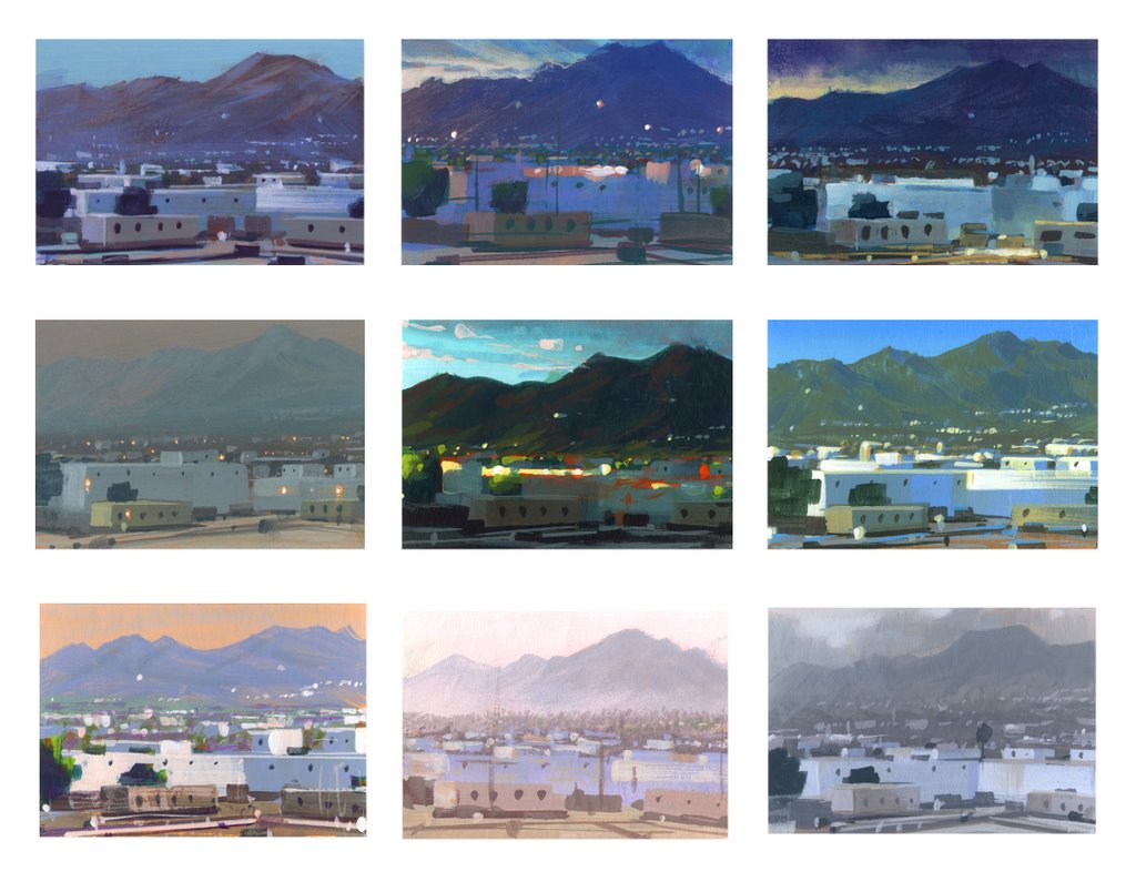
Color Study Follow Up

Watercolor and Oil Glaze on Canson Watercolor paper
For the last week I have been discussing thematic palettes and atmospheric perspective in my classes. I assigned a project where the students have to find one landscape photo that demonstrates clear atmospheric perspective. They then will create three different color schemes for the one landscape. Nathan Fowkes has a wonderful post on his blog showing the many thematic color renditions of the view out his office window. This above photo shows the final version of my three color scheme demos. View the previous post for the earlier palettes.
This painting was done with walnut oil rather than liquin or galkyd so it is still very wet. I took a pic with my iphone and will update a better image when it dries and I can scan it.
Monday, April 12, 2010
Color Studies

Oil on Illustration Board

Oil on Watercolor Paper
This was a quick class demo on painting the same scene with different color palettes. These are bastardized versions of the beautiful Yosemite park. The original pic is a mixture of bright and soft blues.
Monday, April 5, 2010
Eye, Aye, Yi

Oil on Illustration board
This was a demo I did in oils. I wanted my students to work with oils in an anatomical study concentrating on hard and soft edges. I often see eyes painted and drawn flat, losing the roundness of the orb of the eyeball. This single study allowed them time to create and understand the structure.
Sunday, April 4, 2010
Happy Egg Day


I'd like to wish everyone a happy egg day. These photos are of an egg that one of my Moore students, Elise Anzini, was gracious enough to give to me. It must have been all of the egg studies I made her do....it was brainwash!
This is a real egg that has been hollowed out. She then used a batik method by adding hot wax in a design and then dipping the egg into dye. After the egg had been pretty much covered in dye and wax she then baked it.
Thank you, Elise. And also thank you to the mystery person who gifted me a Klimpt tea canister as seen in the background of the first pic. Nimble students, huh?!
Tuesday, March 30, 2010
Loomis Study #3

Copy of Andrew Loomis Portrait Study
The third Loomis study. Again, just looking at colors. Her eye kind of got messed up in the process. Just a bit....flat.
Saturday, March 27, 2010
Loomis Study #2

Copy of Andrew Loomis Portrait Study
Here's another Loomis study. The original painting that he did has a completely different color palette. I wanted to play around with greens and reds so I decided to use his as a guide to lighting and temperature changes.
Tuesday, March 23, 2010
Cherry in That Cookie

Oil on Illustration Board
I'll be back with some more Loomis studies but for now here's a cookie for you to look at.
Monday, March 15, 2010
Andrew Loomis Portrait Studies


Copy of Andrew Loomis Portrait Study
4" x 2"
I have some more small paintings to post but I first would like to spend some time on portrait studies. It is important to constantly study how different painters handle color, value and shape handling. James Gurney mentions in his amazingly informative blog the necessity to copy other artists to truly understand the way that artist's method. The study above is from Andrew Loomis's "Creative Illustration". He has a page of four portraits with different tones, colors, hues and the skin's effect with each palette.
I made a black and white photo copy of Loomis's four small portraits on one letter size sheet. I matt mediumed it. Then tried to copy the colors and tones he was using. This is the second one I did. I found the reflective light to be the most exciting part of the painting. Afterwards I found another image of the portraits online (the link above) and see a different color combo that has much more depth. That's what I get for using a bad color photo copy for my reference!
Thursday, March 11, 2010
Blueberry Tart

Oil on Illustration Board
This was a dessert I bought from a South Philly bakery that was topped with blueberries, stuffed with pastry cream and dusted with powered sugar. The main goal was to quickly represent the temperature of the blueberries and build up the structure enough to show preliminary steps for alla prima painting.
Abandoning my normal use of a little Liquin or Galkyd I used a homemade mixture of Liquin, Turp and Linseed Oil. The washiness of it is not normally how I prefer to lay down initial paint but I thought the use of a thinner medium was a valuable lesson to impress upon the class, especially for those students who prefer a transparent representation.
Wednesday, March 10, 2010
The Fancy Strawberry Man

Oil on Masonite
I used this as a demo on alla prima painting desserts. It happened to be after Valentines day so the local bakery had all sorts of fancy looking strawberries. I usually go for the cannolis myself but I couldn't resist the "cuteness" of it.
Friday, March 5, 2010
Origami

Oil Paint on Cold Press Illustration Board
This was a study on angles and light. I found this origami in the prop closet and decided to give it a chance. It was pretty fun to do. I'm trying to score some more so I can play around with some more angles and patterns.
This painting is also listed in Etsy's Art>Painting gallery for today only. Check out my shop for more updates.
Tuesday, March 2, 2010
March Madness! It's Small Painting Month!

Oil on Masonite
Spring is also the time when I get to introduce students to oil paint. I have been working digitally for so long that going back to the basics gets me giddy. I have so much fun on the demos I do. As you saw in February I had introduced eggs as a beginning. Well now we get into other items like, paper, fabric, portraits and food. Enjoy.
Not Just a Donut....

Oil Paint on Masonite
It's not just a donut....it's a Dunkin' Donut. Toasted Coconut to be exact. This was a small alla prima demo I did. Illustrators usually have a mess of preliminary work to do from thumbnails to sketches to revisions to color comps to finals to reproduction and sometimes to design layout.
It isn't very often that we get a chance to work alla prima. It's fun to play with paint for an hour or two while studying light and form on objects. It's especially fun when you can eat it later. My favorite part of working this way is the free nature of the product. If the painting doesn't work out....who cares? It didn't take that long. Move on....
Subscribe to:
Posts (Atom)


