Showing posts with label demo. Show all posts

Wednesday, May 16, 2012

Spectrum Live! - Luna Moth Oil Painting


We are running late for leaving but I thought I'd squeeze another post before we hit the road.  We will be embarking on a 19 hour trip to Kansas City MO starting in 30 minutes.

This is a little moth study I did.  It started in watercolor as a class demo for my PCAD sophomores and I used it to demo my sophomores at Moore in oil underpainting.  I will take this into Corel Painter to push it farther in order for it to fit in my portfolio.  I will be selling this little guy at Spectrum Live!

Visit me at Spectrum Live! - Booth 220

Friday, February 18, 2011

Oil Study - Valentine Cupcake

6x6 Oil on Board

This was an oil painting demo. It's a mini Valentine cupcake painted in oils on 6"x6" board.

Thursday, April 22, 2010

Color Study Follow Up

Watercolor and Oil Glaze on Canson Watercolor paper

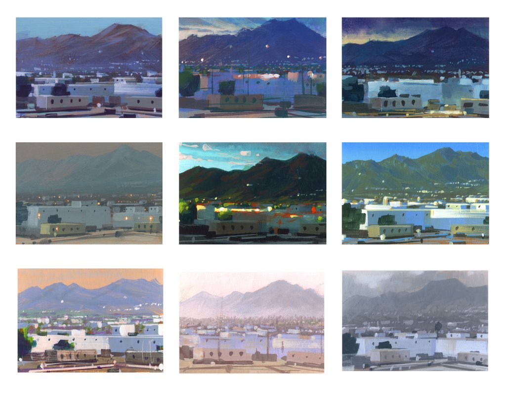
For the last week I have been discussing thematic palettes and atmospheric perspective in my classes. I assigned a project where the students have to find one landscape photo that demonstrates clear atmospheric perspective. They then will create three different color schemes for the one landscape. Nathan Fowkes has a wonderful post on his blog showing the many thematic color renditions of the view out his office window. This above photo shows the final version of my three color scheme demos. View the previous post for the earlier palettes.

This painting was done with walnut oil rather than liquin or galkyd so it is still very wet. I took a pic with my iphone and will update a better image when it dries and I can scan it.

Monday, April 12, 2010

Color Studies

Oil on Illustration Board

Oil on Watercolor Paper

This was a quick class demo on painting the same scene with different color palettes. These are bastardized versions of the beautiful Yosemite park. The original pic is a mixture of bright and soft blues.

Monday, April 5, 2010

Eye, Aye, Yi

Oil on Illustration board

This was a demo I did in oils. I wanted my students to work with oils in an anatomical study concentrating on hard and soft edges. I often see eyes painted and drawn flat, losing the roundness of the orb of the eyeball. This single study allowed them time to create and understand the structure.

Tuesday, March 30, 2010

Loomis Study #3

Copy of Andrew Loomis Portrait Study

The third Loomis study. Again, just looking at colors. Her eye kind of got messed up in the process. Just a bit....flat.

Saturday, March 27, 2010

Loomis Study #2

Copy of Andrew Loomis Portrait Study

Here's another Loomis study. The original painting that he did has a completely different color palette. I wanted to play around with greens and reds so I decided to use his as a guide to lighting and temperature changes.

Tuesday, March 23, 2010

Cherry in That Cookie

Oil on Illustration Board

I'll be back with some more Loomis studies but for now here's a cookie for you to look at.

Monday, March 15, 2010

Andrew Loomis Portrait Studies


Copy of Andrew Loomis Portrait Study
4" x 2"

I have some more small paintings to post but I first would like to spend some time on portrait studies. It is important to constantly study how different painters handle color, value and shape handling. James Gurney mentions in his amazingly informative blog the necessity to copy other artists to truly understand the way that artist's method. The study above is from Andrew Loomis's "Creative Illustration". He has a page of four portraits with different tones, colors, hues and the skin's effect with each palette.

I made a black and white photo copy of Loomis's four small portraits on one letter size sheet. I matt mediumed it. Then tried to copy the colors and tones he was using. This is the second one I did. I found the reflective light to be the most exciting part of the painting. Afterwards I found another image of the portraits online (the link above) and see a different color combo that has much more depth. That's what I get for using a bad color photo copy for my reference!

Thursday, March 11, 2010

Blueberry Tart

Oil on Illustration Board

This was a dessert I bought from a South Philly bakery that was topped with blueberries, stuffed with pastry cream and dusted with powered sugar. The main goal was to quickly represent the temperature of the blueberries and build up the structure enough to show preliminary steps for alla prima painting.

Abandoning my normal use of a little Liquin or Galkyd I used a homemade mixture of Liquin, Turp and Linseed Oil. The washiness of it is not normally how I prefer to lay down initial paint but I thought the use of a thinner medium was a valuable lesson to impress upon the class, especially for those students who prefer a transparent representation.

Wednesday, March 10, 2010

The Fancy Strawberry Man

Oil on Masonite

I used this as a demo on alla prima painting desserts. It happened to be after Valentines day so the local bakery had all sorts of fancy looking strawberries. I usually go for the cannolis myself but I couldn't resist the "cuteness" of it.


Tuesday, March 2, 2010

March Madness! It's Small Painting Month!

Oil on Masonite

So Philadelphia got over three feet of snow this winter....whatever. It just makes me appreciate the first flower of spring so much more.

Spring is also the time when I get to introduce students to oil paint. I have been working digitally for so long that going back to the basics gets me giddy. I have so much fun on the demos I do. As you saw in February I had introduced eggs as a beginning. Well now we get into other items like, paper, fabric, portraits and food. Enjoy.


Not Just a Donut....

Oil Paint on Masonite

It's not just a donut....it's a Dunkin' Donut. Toasted Coconut to be exact. This was a small alla prima demo I did. Illustrators usually have a mess of preliminary work to do from thumbnails to sketches to revisions to color comps to finals to reproduction and sometimes to design layout.

It isn't very often that we get a chance to work alla prima. It's fun to play with paint for an hour or two while studying light and form on objects. It's especially fun when you can eat it later. My favorite part of working this way is the free nature of the product. If the painting doesn't work out....who cares? It didn't take that long. Move on....

Sunday, February 14, 2010

Egg Month! Ow....My eyes.

Oil on Illustration Board

What's in that paintbox? Every once in a while I will acquire a new color that I rarely use. In this case I found a tube of Cadmium Orange and decided to take out for a demo.

The magic of compliments. Adding blue to orange turned the shadows green. Using a bright saturated color keeps one in practice of the age old theory that opposites really do attract.

This will be the last of the egg paintings. Not to worry. More fun little studies to come.

Wednesday, February 3, 2010

Egg Month! You Failed!


Both are acrylic on gessoed water color paper


Some days are better than others. Some paintings are stronger than others. Some days I wish I would have went to veterinary school. Some call it writers block others call it a creative stint. I call it bored and antsy. At this point I painted my fair share of eggs and wanted to try a fun color. The green was working but I got bored and wanted to peek around at the students work which was coming out better than mine.

Lesson to be learned. Don't fall in love with your paintings and never expect a masterpiece from a study. Underpainting was cool. Overpainting....not so much. Failed.

Egg Month! Warning: This is not an egg

Oil on Masonite

This was a quick demo on reflective surfaces and glazing. After drying I coated it with galkyd. Alot of times when painting in oils the paint dries dull. Varnishing will bring life back into the colors.

Thursday, January 14, 2010

I am Such a Liar

Corel Painter Class Demo

So I said it would be 7 straight days of posts. But I've missed the last two days. There is an explanation....I promise!! Long story short....deadline & New York Society of Illustrators trip. But by the 7th day I will have 7 posts. Even if I have to double up posts on one day....which I plan to do now.

First I'm starting with a small Painter study I did for my Saturday class in December. It's a bit out of season and I met to get this posted before the holiday but didn't get a chance to. It was a quick demo on reflected surfaces. It's not as shiny as many glass ornaments due to the burnished finish. I also have some big beautiful Christmas lights that I want to paint to practice illumination and colored light. Baby steps.

Saturday, October 10, 2009

Painting Demo

This is a demo I did for my class at the University of the Arts. The class is based on the techniques of Corel Painter...a digital program that mimics traditional medium. I used an image of one of my mom's irises and painted it using the the oil brushes. No matter if you choose to paint digitally or traditionally you have to understand drawing, composition, color and value. The computer will not magically make everything beautiful which is a common misconception when considering digital work.

Thursday, February 5, 2009

In Class Studies


These are two oil demos I did for my pictorial fundamental classes. The first one was on masonite with a thick layer of gesso. I toned the surface with acrylic burnt umber. The second was toned the same but on gessoed illustration board. I didn't get a chance to take the tape off so it still looks like it's in progress. Both took about an hour each to complete.