Showing posts with label study. Show all posts

Monday, August 22, 2011

Watercolor Pencils

Watercolor Pencil

We were visiting Dom's parents farm in the mountains of New Jersey and I saw these cool funky flowers. It gave me an excuse to try out a watercolor pencil that was given to me. They are pretty awesome. I'm looking forward to working on them some more.

Monday, August 8, 2011

Lily Study

I had a crazy summer and am only now getting back onto my blog. My schedule is still filled but I at least have a few weeks of catch up before the fall starts. This is a study of lilies for a GreenPrints piece I did.

Wednesday, June 1, 2011

Fold Study - John William Godward


John William Godward is a source of great inspiration for me. This is an unfinished study I did in about 45 minutes to understand the way he painted folds. I am currently working on a commission that has similar folds and color scheme and I found it extremely helpful to practice from a master before tackling it myself. This was done in Corel Painter with a Wacom Intuos 4.

Saturday, April 30, 2011

Serval Study


This is a study of a serval which is an African wild cat. I am working on a private commission that deals with several wild cats and a beautiful lady. I have just started the sketching process and will be creating many studies of the cats as well as some other elements including a staff with a totem twist.

This is a really great project and I have been anxious to start it! I'll be posting the bits and pieces of process as I go. The deadline is in early/mid summer.


Friday, February 18, 2011

Oil Study - Valentine Cupcake

6x6 Oil on Board

This was an oil painting demo. It's a mini Valentine cupcake painted in oils on 6"x6" board.

Thursday, December 30, 2010

End of the Year Clean Up


Watercolor on Bristol

It's amazing how teaching at three different colleges can put me in a tail spin during the span of one semester. Once I finish with a lesson I dump the bag filled with whatever material I was using in my studio until I can find time to clean it out. Well, I just did one of five totes tonight and found this watercolor study. Unfortunately, I didn't get a chance to finish it. I would like to say that I'll work on the chipmunk and spider but in all honesty that probably won't happen. Watercolors are fun but by no means are they my forte.

This will end up in my file of misfits. Unloved and unfinished. But I at least grabbed one swatch to use in a pattern repeat for your viewing pleasure.

Happy new year to all and may you find organization and cleanliness in your studio.

Tuesday, July 6, 2010

Mini Tree Study

Oil on Illustration Board

I did this awhile back on a plein air excursion with my PCAD students. It was a really quick study. I had fun with it but I was only using a four color palette and it felt limited to me. Normally I like that challenge but I was getting frustrated with it.

In a few weeks we will be in Colorado. We will be doing some plein air painting with Will Spear who graduated with us from Uarts. His paintings are amazing and I'm looking forward to setting up shop a few times in Yellowstone and possibly the Tetons!

His wife Shelly is extremely knowledgeable on the plants and flowers in the area so I may be picking her brain for names. If I don't get too carried away with all the hiking and sight seeing I may be able to create a good sketch book from this trip. We'll see....I will at least come back with a great farmers tan!

Thursday, April 22, 2010

Color Study Follow Up

Watercolor and Oil Glaze on Canson Watercolor paper

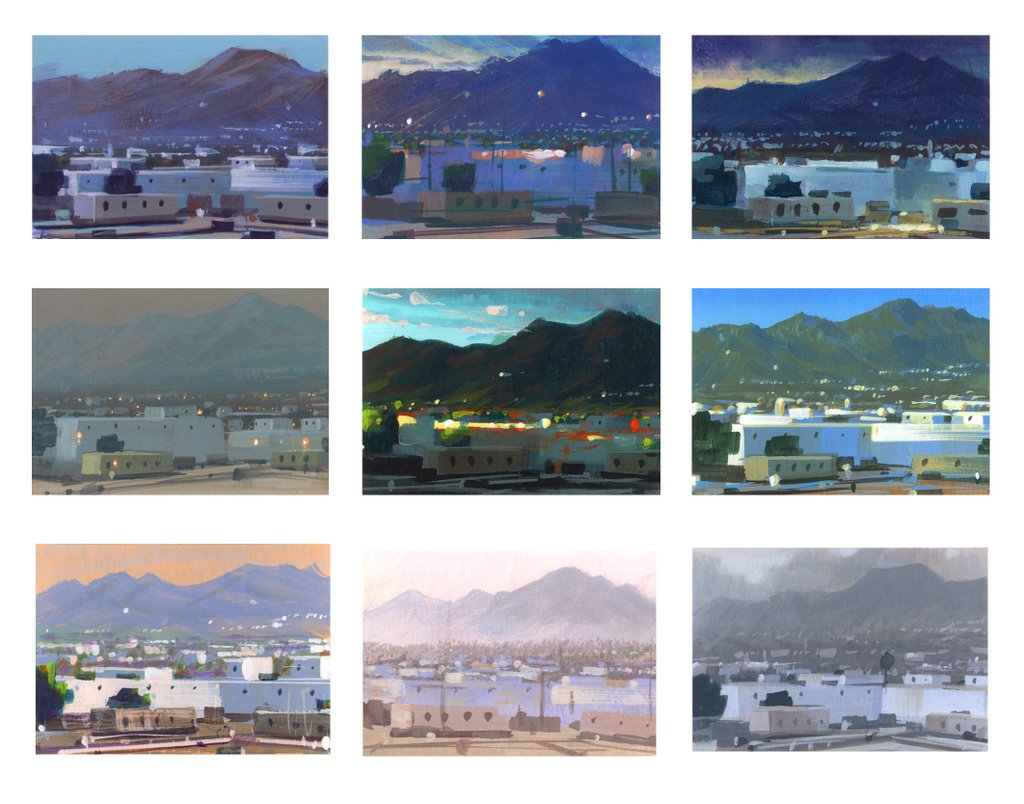
For the last week I have been discussing thematic palettes and atmospheric perspective in my classes. I assigned a project where the students have to find one landscape photo that demonstrates clear atmospheric perspective. They then will create three different color schemes for the one landscape. Nathan Fowkes has a wonderful post on his blog showing the many thematic color renditions of the view out his office window. This above photo shows the final version of my three color scheme demos. View the previous post for the earlier palettes.

This painting was done with walnut oil rather than liquin or galkyd so it is still very wet. I took a pic with my iphone and will update a better image when it dries and I can scan it.

Monday, April 12, 2010

Color Studies

Oil on Illustration Board

Oil on Watercolor Paper

This was a quick class demo on painting the same scene with different color palettes. These are bastardized versions of the beautiful Yosemite park. The original pic is a mixture of bright and soft blues.

Tuesday, March 30, 2010

Loomis Study #3

Copy of Andrew Loomis Portrait Study

The third Loomis study. Again, just looking at colors. Her eye kind of got messed up in the process. Just a bit....flat.

Saturday, March 27, 2010

Loomis Study #2

Copy of Andrew Loomis Portrait Study

Here's another Loomis study. The original painting that he did has a completely different color palette. I wanted to play around with greens and reds so I decided to use his as a guide to lighting and temperature changes.

Tuesday, March 23, 2010

Cherry in That Cookie

Oil on Illustration Board

I'll be back with some more Loomis studies but for now here's a cookie for you to look at.

Thursday, March 11, 2010

Blueberry Tart

Oil on Illustration Board

This was a dessert I bought from a South Philly bakery that was topped with blueberries, stuffed with pastry cream and dusted with powered sugar. The main goal was to quickly represent the temperature of the blueberries and build up the structure enough to show preliminary steps for alla prima painting.

Abandoning my normal use of a little Liquin or Galkyd I used a homemade mixture of Liquin, Turp and Linseed Oil. The washiness of it is not normally how I prefer to lay down initial paint but I thought the use of a thinner medium was a valuable lesson to impress upon the class, especially for those students who prefer a transparent representation.

Wednesday, March 10, 2010

The Fancy Strawberry Man

Oil on Masonite

I used this as a demo on alla prima painting desserts. It happened to be after Valentines day so the local bakery had all sorts of fancy looking strawberries. I usually go for the cannolis myself but I couldn't resist the "cuteness" of it.


Friday, March 5, 2010

Origami

Oil Paint on Cold Press Illustration Board

This was a study on angles and light. I found this origami in the prop closet and decided to give it a chance. It was pretty fun to do. I'm trying to score some more so I can play around with some more angles and patterns.

This painting is also listed in Etsy's Art>Painting gallery for today only. Check out my shop for more updates.

Tuesday, March 2, 2010

March Madness! It's Small Painting Month!

Oil on Masonite

So Philadelphia got over three feet of snow this winter....whatever. It just makes me appreciate the first flower of spring so much more.

Spring is also the time when I get to introduce students to oil paint. I have been working digitally for so long that going back to the basics gets me giddy. I have so much fun on the demos I do. As you saw in February I had introduced eggs as a beginning. Well now we get into other items like, paper, fabric, portraits and food. Enjoy.


Sunday, February 14, 2010

Egg Month! Ow....My eyes.

Oil on Illustration Board

What's in that paintbox? Every once in a while I will acquire a new color that I rarely use. In this case I found a tube of Cadmium Orange and decided to take out for a demo.

The magic of compliments. Adding blue to orange turned the shadows green. Using a bright saturated color keeps one in practice of the age old theory that opposites really do attract.

This will be the last of the egg paintings. Not to worry. More fun little studies to come.

Thursday, February 11, 2010

Egg Month! Complimentary colors within white

Oil on Illustration Board

In honor of my snow day (Philadelphia's snowiest winter in history....75 inches and more to come) today I am going to spend some time talking about white. It's clean and simple...well it's simple until you try to paint it. It does make sense after doing it a few times, like everything, it just takes practice.

It's rather easy if you don't think too much about it. White takes on the color of it's surroundings. A white egg on a purple background will have a lot of purple and a warm compliment of purple. A sunset landscape will take on the color of the sun and it's compliment. I have a few links that shows some artist's use of white. Take a gander and really look to see how they work with it. Michael Whelan Greg Manchess Andrew Wyeth

Wednesday, February 3, 2010

Egg Month! You Failed!


Both are acrylic on gessoed water color paper


Some days are better than others. Some paintings are stronger than others. Some days I wish I would have went to veterinary school. Some call it writers block others call it a creative stint. I call it bored and antsy. At this point I painted my fair share of eggs and wanted to try a fun color. The green was working but I got bored and wanted to peek around at the students work which was coming out better than mine.

Lesson to be learned. Don't fall in love with your paintings and never expect a masterpiece from a study. Underpainting was cool. Overpainting....not so much. Failed.

Egg Month! Warning: This is not an egg

Oil on Masonite

This was a quick demo on reflective surfaces and glazing. After drying I coated it with galkyd. Alot of times when painting in oils the paint dries dull. Varnishing will bring life back into the colors.