Showing posts with label oils. Show all posts

Thursday, April 22, 2010

Color Study Follow Up

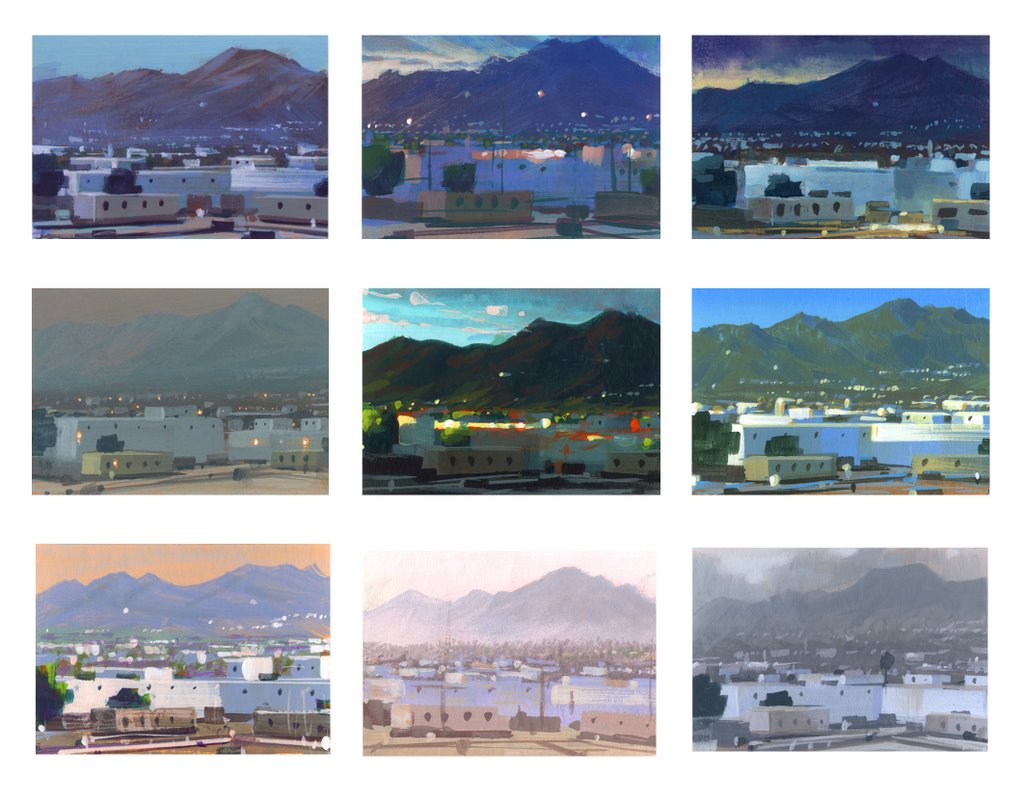
Watercolor and Oil Glaze on Canson Watercolor paper

For the last week I have been discussing thematic palettes and atmospheric perspective in my classes. I assigned a project where the students have to find one landscape photo that demonstrates clear atmospheric perspective. They then will create three different color schemes for the one landscape. Nathan Fowkes has a wonderful post on his blog showing the many thematic color renditions of the view out his office window. This above photo shows the final version of my three color scheme demos. View the previous post for the earlier palettes.

This painting was done with walnut oil rather than liquin or galkyd so it is still very wet. I took a pic with my iphone and will update a better image when it dries and I can scan it.

Saturday, March 27, 2010

Loomis Study #2

Copy of Andrew Loomis Portrait Study

Here's another Loomis study. The original painting that he did has a completely different color palette. I wanted to play around with greens and reds so I decided to use his as a guide to lighting and temperature changes.

Thursday, February 11, 2010

Egg Month! Complimentary colors within white

Oil on Illustration Board

In honor of my snow day (Philadelphia's snowiest winter in history....75 inches and more to come) today I am going to spend some time talking about white. It's clean and simple...well it's simple until you try to paint it. It does make sense after doing it a few times, like everything, it just takes practice.

It's rather easy if you don't think too much about it. White takes on the color of it's surroundings. A white egg on a purple background will have a lot of purple and a warm compliment of purple. A sunset landscape will take on the color of the sun and it's compliment. I have a few links that shows some artist's use of white. Take a gander and really look to see how they work with it. Michael Whelan Greg Manchess Andrew Wyeth

Wednesday, February 3, 2010

Egg Month! Underpainting and Overpainting


Acrylic Underpainting (Bottom)
Oil Overpainting (Top) on Illustration Board

Question: Why do an underpainting if I'm going to cover it with color anyway?

Underpainting is beneficial to do for several reasons:

1. All value and drawing problems can be figured out in this monochromatic stage.
2. When overpainting you concentrate on the color and temperature not the value. To match the overpainting color squint at your underpainting and chosen color and you will see the value relationship. This I learned from the esteemed Professor McGovern at Uarts.
3. Underpainting can be done in acrylic to assist in fast deadlines.
4. Underpainting can show through to assist in color and temperature.

Under-paintings can be any color. If your key color is going to be red try a green underpainting. That green can show through in the shadows to create a complimentary temperature change. If your unsure burnt umber is always a good bet. It can take on a cool or warm tone depending on the overpainting color.

Saturday, April 19, 2008

Pink Rose

SOLD
This was a small oil study completed in one morning. It's been awhile since I worked in oils and encountered some old problems I forgot about. White can be such a killer! It was accepted into the small oils show at the Philadelphia Sketch club and will be up for another week. I'm excited to work on the next one but will not be able to get to it until classes end in a few weeks.

5"x7" Oil on Canvas